When you look at this TIME infographic, do you think that 3/4 million Iran/Afghanistan vets have PTSD? (30% of 2.5 million)
Or did you notice that the caption under the 30% says, “of veterans treated by the VA”?
From TIME magazine March 25 2013, Commentary by Joe Klein, “Ten Years After: A National Disgrace”
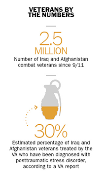
In fact, with the information provided, you can’t come up with a number of vets, because we aren’t told how many vets have been treated by the VA.
I’m sure this is not intentionally misleading. But I think it has strong potential to be misinterpreted. Misintepretation is encouraged by both:
- the second caption being full of qualifying phrases, in which this important one gets buried.
- the relative scale of the numbers and the captions.
Furthermore, I question the choice of a hand grenade icon to represent PTSD. I’ve read previously in TIME that many vets with PTSD do not act out in dangerous ways.
It would be a tragic irony if many people wrongly conclude that a huge portion of Iran/Afghanistan vets have explosive PTSD, especially since the accompanying editorial mentions that employers are often afraid to hire them.
NOTE: This infographic does not appear in the web version of the article. However, it does appear in the iPad and print issues.
Leave a Reply