I created this map for a client who wanted a friendly sort of drawn map — the antithesis of Google Maps. She also wanted an icon to go with an accomplishment for each neighborhood. It was my choice to make the icons big and bold.
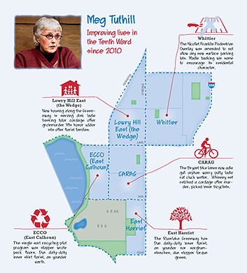 The map is being used in a print piece for a candidate. She’s the incumbent in a City Council race in Minneapolis. The audience for the piece is the ward’s residents, so the map doesn’t have to be labeled with the city name.
It’s created in Adobe Illustrator. Effects are added to vector shapes to give them a hand-drawn feel. A couple of the icons are modified from stock images.
I’m pleased to get work from clients in a place where I haven’t lived for over 16 years!
For more maps I’ve created, see my portfolio.
Leave a Reply